Chipiron
Who? A software that allows companies to comply with the CSRD. Problem? The current logo and branding felt too young and playful. Solution? A full brand refresh focused on three key areas: Tech – tracking and collecting complex data from different sources in one software. Human – Providing the support to manage this data and pass regulation. Sustainability – at the backbone of this data.
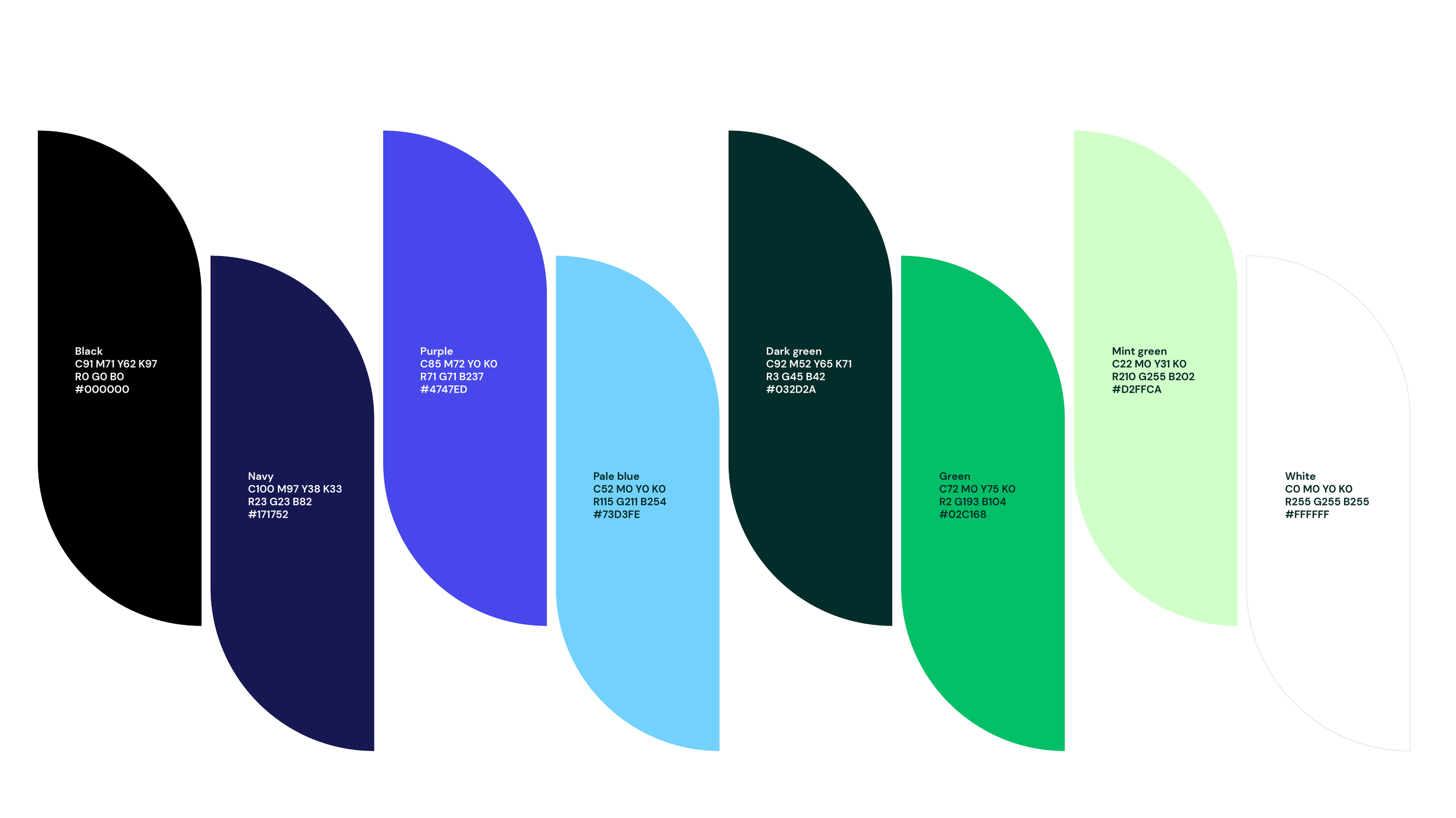
A slick graphic illustration style was created combining the theme of data collection and sustainability. This was then threaded subtly into a bold simplified logo and icon. An expanded colour palette was designed to bring life to the graphics and avoid a purely ‘green’ cliche sustainability visual style. Warm photography brought to life the human element that is at the core of the business.
Deliverables: Logo Design, Brand Identity and guardienship, Web design, Illustration, Digital content, Guidelines


