Circl
Who? A price comparison app for grocery shopping – bringing the purchasing power back to the consumer and making groceries affordable to all, whilst also avoiding food waste. Problem? A startup with zero branding. Solution? Driven by the key themes of community and inclusivity an accessible, friendly, cohesive and functional brand identity was created.
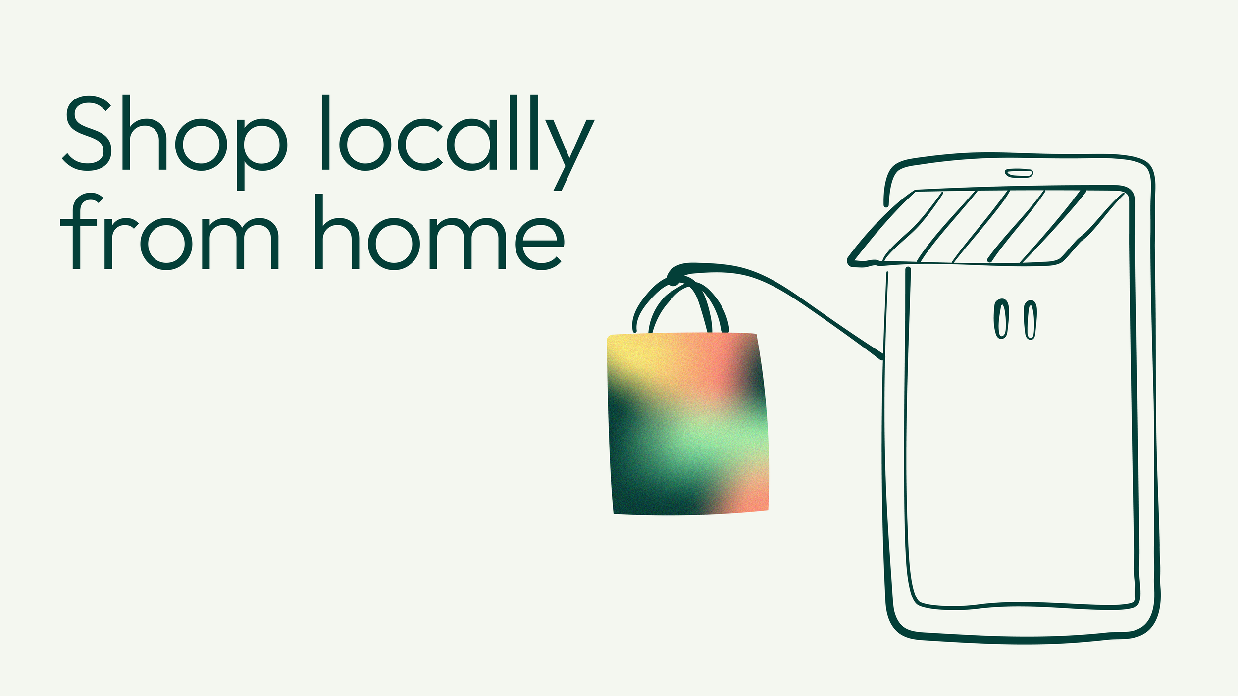
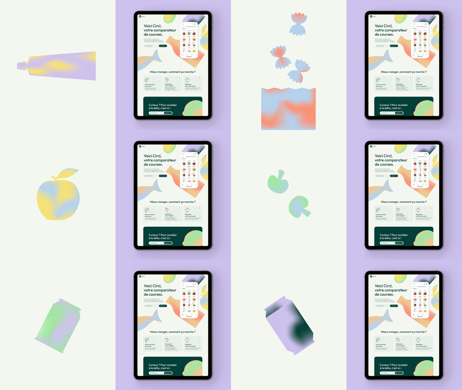
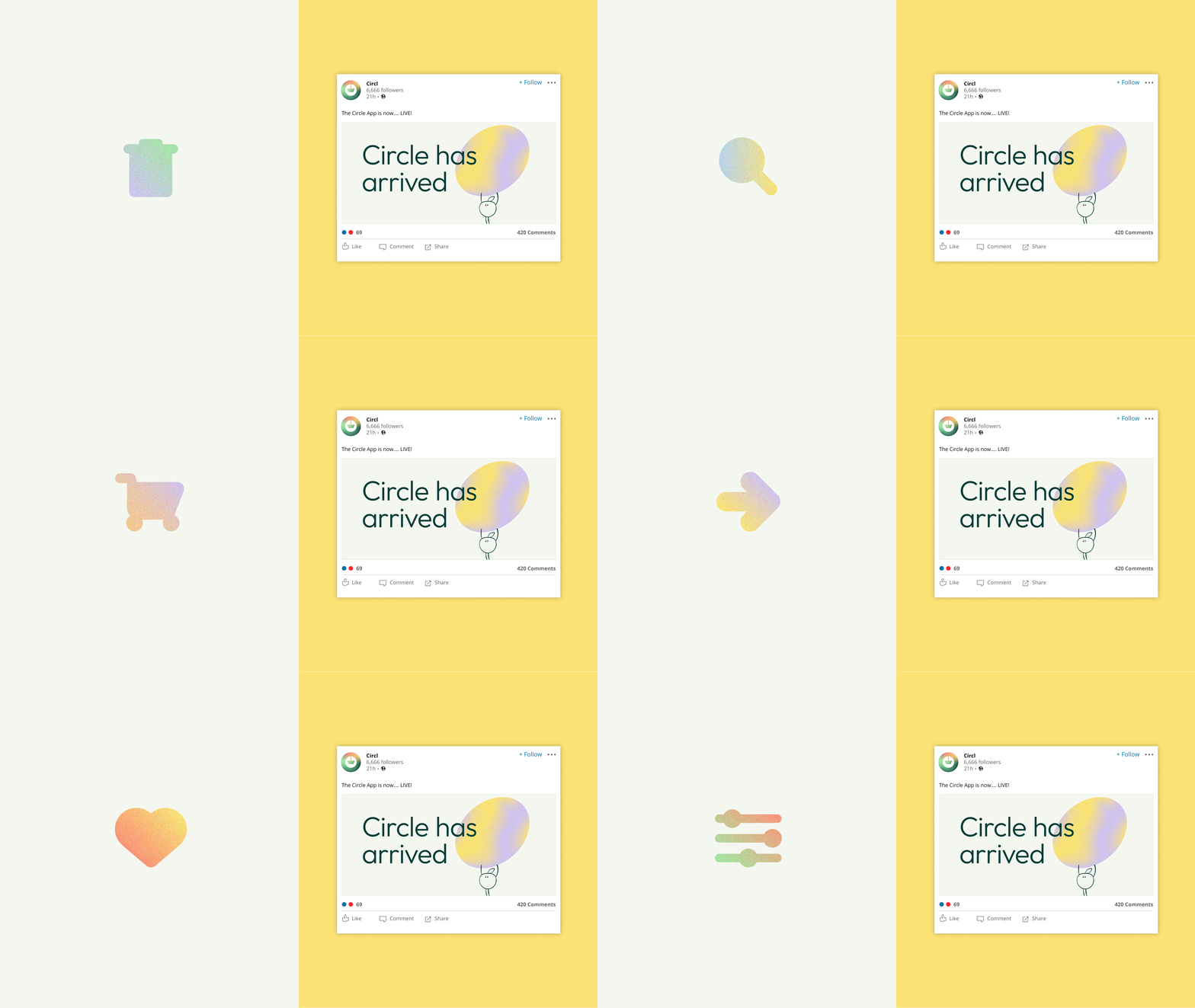
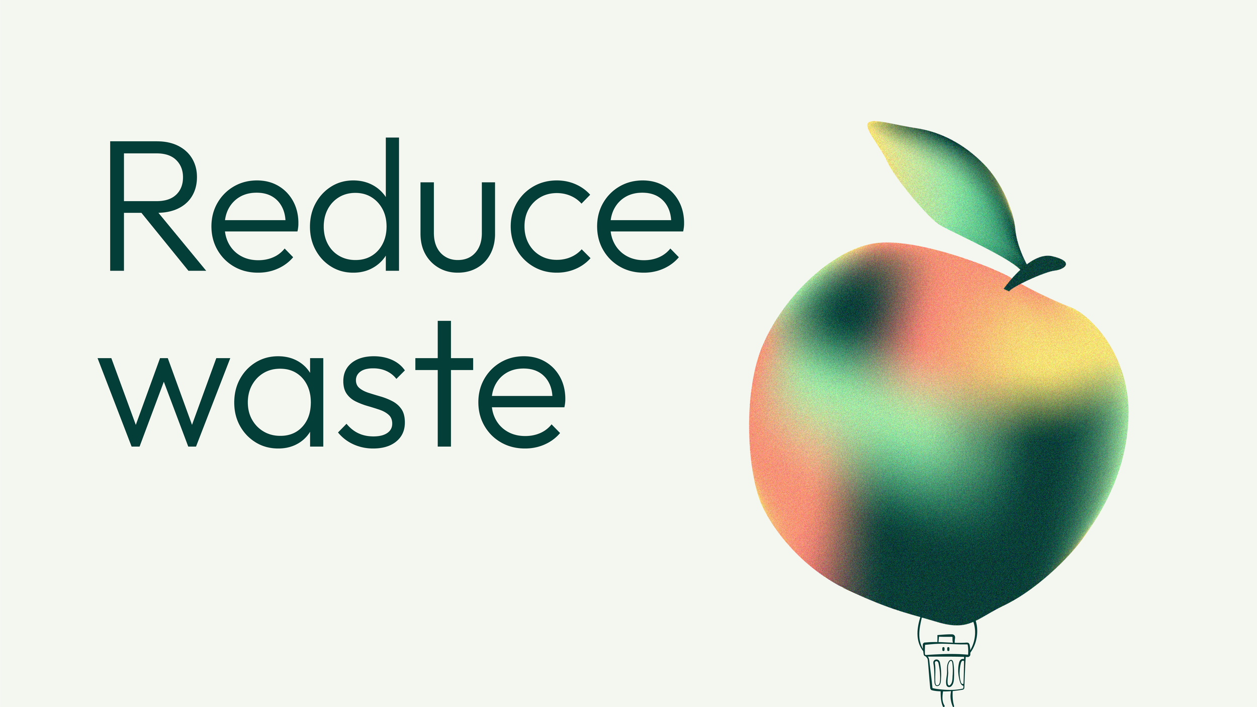
A soft, wide ranging colour palette and light weight geometric typeface support a strong illustrative visual identity. Two supermarket related illustration suites were created to help enrich the storytelling: one library of cut out style objects in organic gradients for depth and texture. The second – a set of animated characters to bring life, warmth, personality (and a little wink and smile) to the brand. A stylised icon suite was also created to add branded functionality to the app.
Deliverables: Logo Design, Brand Identity and guardienship, Web design, Illustration, Digital content, Guidelines
